
Product design · 2023–2024
Three roles. One product. Zero room for confusion.
An exam-centre product had to work for centre heads, invigilators and students. The mistake would have been treating them as one user.
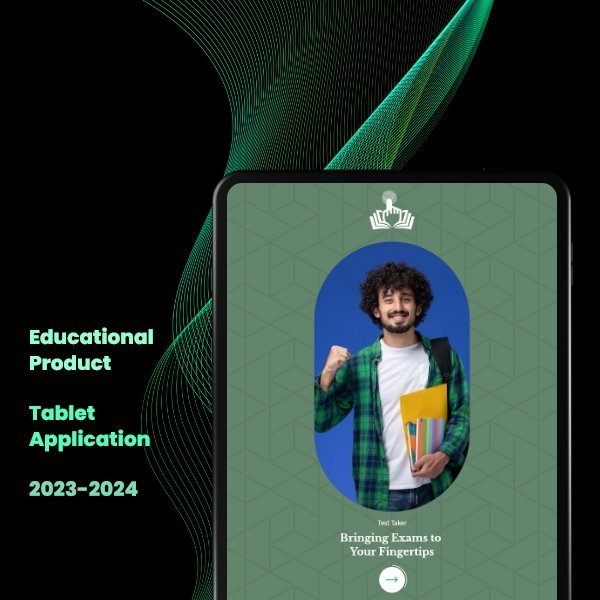
Education and assessment
Lead UI/UX designer
2023–2024
What was happening
The visible interface was not the whole problem.
The client came with an early concept and three very different users. A centre head needed control. An invigilator needed speed. A student needed calm. Putting every feature in one common flow would have made the product easier to build, but harder for everyone to use.
The thing I noticed
Good UX does not make every user see the same thing. It gives every user the right thing at the right time.
What I changed
Three decisions shaped the work.
- 01
I separated the three jobs before designing the screens.
- 02
I gave each role a clear first action and removed everything they did not need in that moment.
- 03
Then I brought the journeys back together through one familiar visual language, so the product still felt like one system.
What became easier
Less hesitation. More confident action.
Each person could enter the product and understand what to do next without learning the entire system. The complexity stayed in the product logic. It stopped sitting on the user’s screen.
Have a product that takes too long to explain?
Bring me the messy version ↗