
Selected work
Every case study begins before the screen.
These are not feature inventories. They are short stories about the confusion I found, the decisions I made, and what became easier afterward.
 Read case study ↗
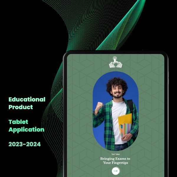
Product design · 2023–2024
Three roles. One product. Zero room for confusion.
An exam-centre product had to work for centre heads, invigilators and students. The mistake would have been treating them as one user.
 Read case study ↗
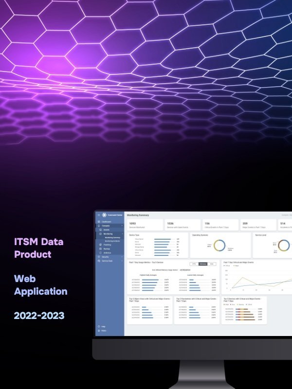
Enterprise redesign · 2022–2023
The data was there. The clarity wasn’t.
A platform had plenty of information, yet decision-makers still struggled to understand what needed attention.
 Read case study ↗
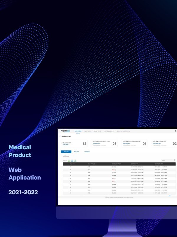
UX modernisation · 2021–2022
A legacy product people had learned to tolerate.
The product worked, but every task asked users to work around the interface. The redesign had to improve that without breaking years of business logic.
 Read case study ↗
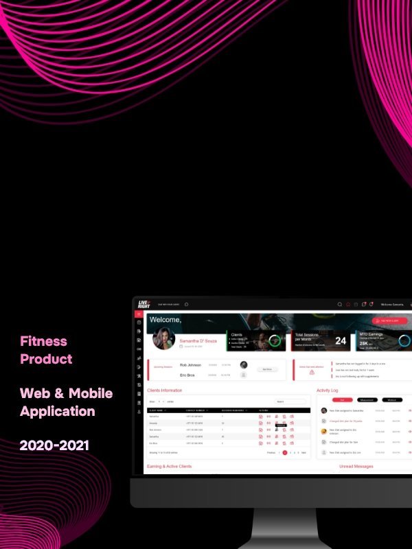
Web and mobile product · 2020–2021
A fitness product that did not need a trainer to explain it.
Trainers needed control. Clients needed motivation. The product had to support both without making either side feel like an afterthought.
 Read case study ↗
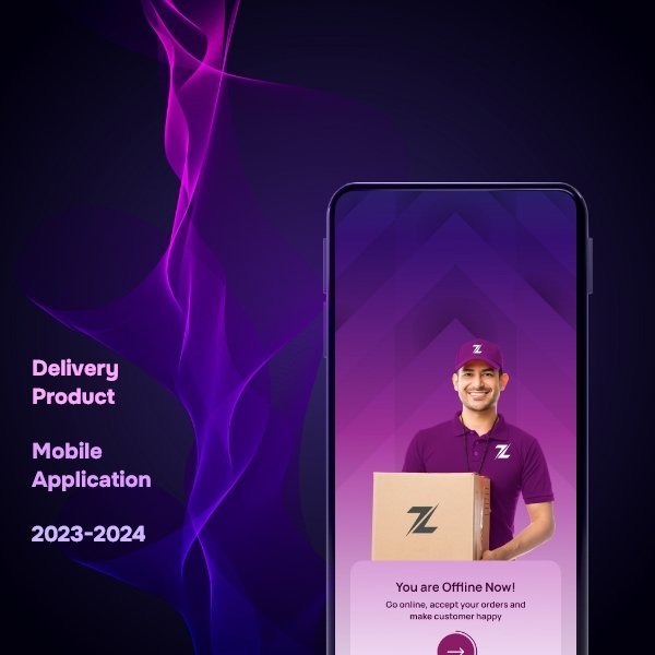
Mobile product · 2023–2024
Built for people who could not stop and study the screen.
A delivery app in the UAE had to stay understandable while its users were moving, waiting and working under pressure.
 Read case study ↗
SaaS product design · 2020–2021
Learning should feel like progress, not administration.
A workplace learning platform needed depth for administrators without passing that complexity to learners.