
Enterprise redesign · 2022–2023
The data was there. The clarity wasn’t.
A platform had plenty of information, yet decision-makers still struggled to understand what needed attention.
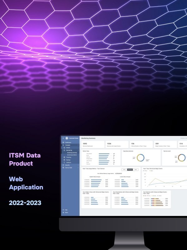
ITSM and data intelligence
Lead UI/UX designer
2022–2023
What was happening
The visible interface was not the whole problem.
The product had grown screen by screen. Colours changed. Patterns changed. Data lived everywhere. Users could find numbers, but they could not always tell which number mattered or what they should do about it.
The thing I noticed
More data does not create more confidence. Better hierarchy does.
What I changed
Three decisions shaped the work.
- 01
I stopped treating the dashboard as a place to display everything.
- 02
I grouped information by the decisions people came to make, not by the way the database stored it.
- 03
I simplified the navigation and built a consistent hierarchy so users could move from signal to detail without losing context.
What became easier
Less hesitation. More confident action.
The interface became quieter. Important information became easier to notice. Users could follow the story in the data instead of assembling that story themselves.
Have a product that takes too long to explain?
Bring me the messy version ↗