
UX modernisation · 2021–2022
A legacy product people had learned to tolerate.
The product worked, but every task asked users to work around the interface. The redesign had to improve that without breaking years of business logic.
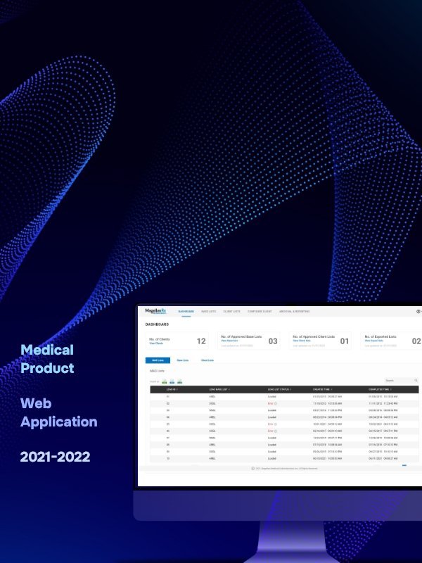
Healthcare
Lead UI/UX designer
2021–2022
What was happening
The visible interface was not the whole problem.
The system carried years of additions, extra clicks and old interface patterns. Users had adapted to it, which can look like success from the outside. In reality, they had simply memorised the friction.
The thing I noticed
A redesign should respect what users already know, but it should never confuse familiarity with good experience.
What I changed
Three decisions shaped the work.
- 01
I studied the existing behaviour before changing the visible interface.
- 02
I reduced repeated steps and made the most common journeys easier to scan.
- 03
I introduced the new brand through a practical design system that developers could apply without rebuilding the product from zero.
What became easier
Less hesitation. More confident action.
The product felt current without becoming unfamiliar. Users kept the workflows they depended on, but no longer had to fight the interface at every step.
Have a product that takes too long to explain?
Bring me the messy version ↗