
Mobile product · 2023–2024
Built for people who could not stop and study the screen.
A delivery app in the UAE had to stay understandable while its users were moving, waiting and working under pressure.
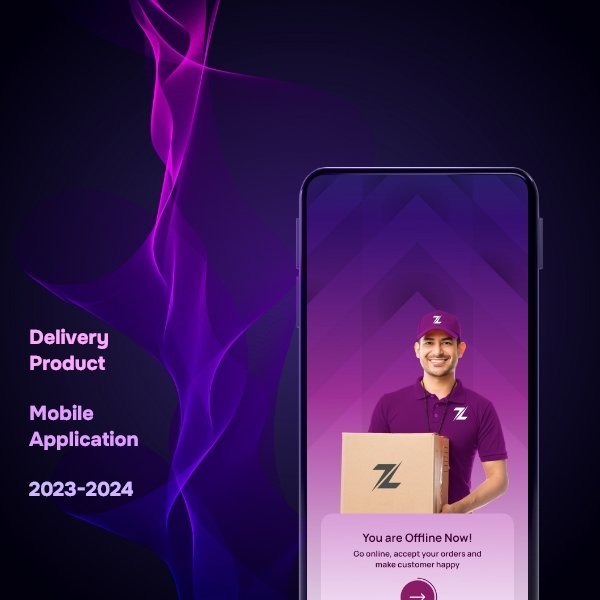
Delivery services
UI/UX designer
2023–2024
What was happening
The visible interface was not the whole problem.
The people using the app had different levels of digital confidence and very little patience for unclear labels. A small moment of hesitation could interrupt a real delivery.
The thing I noticed
When people use a product under pressure, clarity is not polish. It is performance.
What I changed
Three decisions shaped the work.
- 01
I replaced system language with the words people use while working.
- 02
I made the next action visually dominant and kept supporting details close to it.
- 03
I reviewed the flow as a sequence of real delivery moments, not a collection of screens.
What became easier
Less hesitation. More confident action.
The experience became easier to scan and harder to misunderstand. Users could move through a task without hunting for the next button.
Have a product that takes too long to explain?
Bring me the messy version ↗