
Web and mobile product · 2020–2021
A fitness product that did not need a trainer to explain it.
Trainers needed control. Clients needed motivation. The product had to support both without making either side feel like an afterthought.
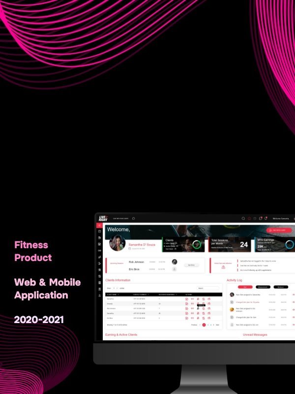
Health and fitness
UI/UX designer
2020–2021
What was happening
The visible interface was not the whole problem.
We were starting from zero with two user groups, many possible features and no established behaviour to inherit. The risk was building a large fitness platform before defining the small actions people would repeat every day.
The thing I noticed
Engagement begins when the next useful action feels obvious.
What I changed
Three decisions shaped the work.
- 01
I studied how trainers planned work and how clients recorded progress.
- 02
I defined the few loops that made the product useful: plan, act, record and review.
- 03
Everything else was organised around making those loops faster and easier to return to.
What became easier
Less hesitation. More confident action.
Trainers could manage plans without losing the person behind the data. Clients could understand today’s action without navigating the entire programme.
Have a product that takes too long to explain?
Bring me the messy version ↗